Mubadala Health Office, Abu Dhabi
Text provided by design & build contractors. At the design concept stage the client requested for 3 very different and unique design concepts from each of the companies involved in the pitching stage. Design concepts not only had to be unique in space planning but in aesthetics as well.
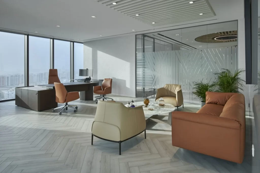
For their Head office the client requirement was two distinct zones – a client facing “executive zone” and a practical & efficient “work zone”. A separate multiuse work lounge area – for informal gatherings, quick discussions, lunches and of course for some amount of relaxation during a busy work day was also introduced in the zoning. The central spine hosting visitors, consisting of meetings rooms and the reception area was something that Spacewell introduced in their zoning to tie up the whole space.
What Spacewell understood from the client brief was that the design needed to reflect the Mubadala ideology. It needed to reflect the brand and showcase the futuristic perspective of the company through space, and this is exactly what they endeavoured to do – showcase Mubadala Health as the next generation of healthcare provider.
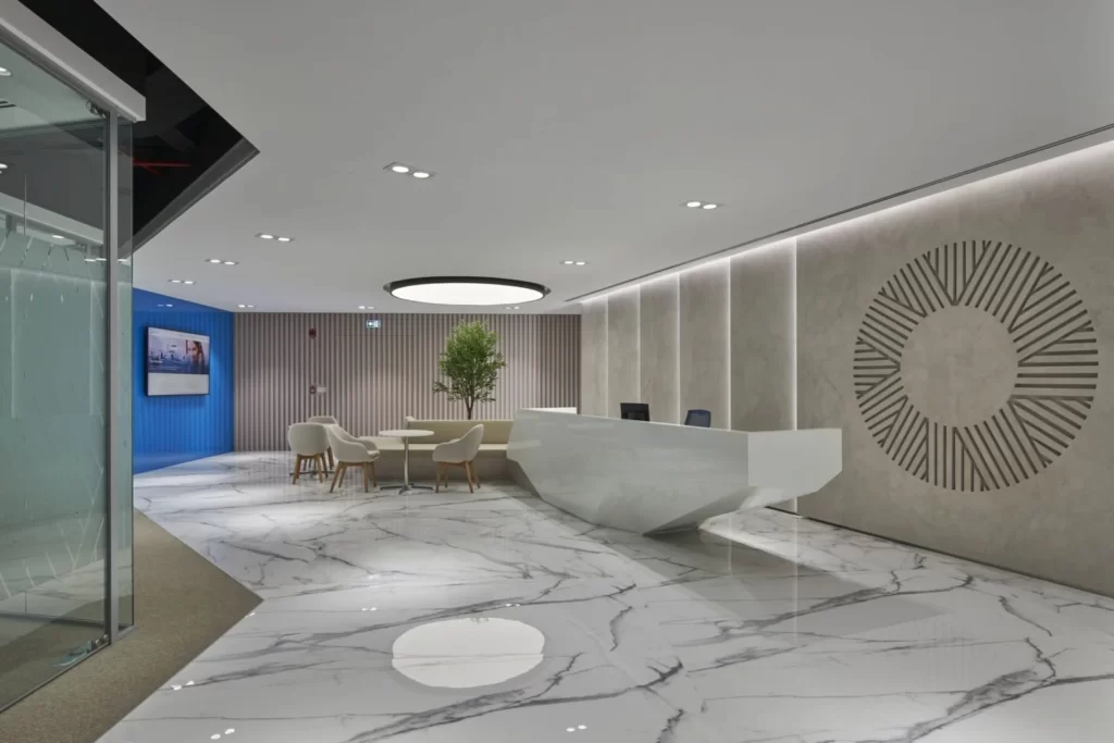
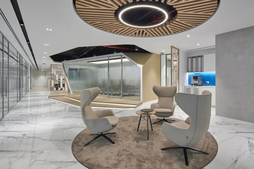
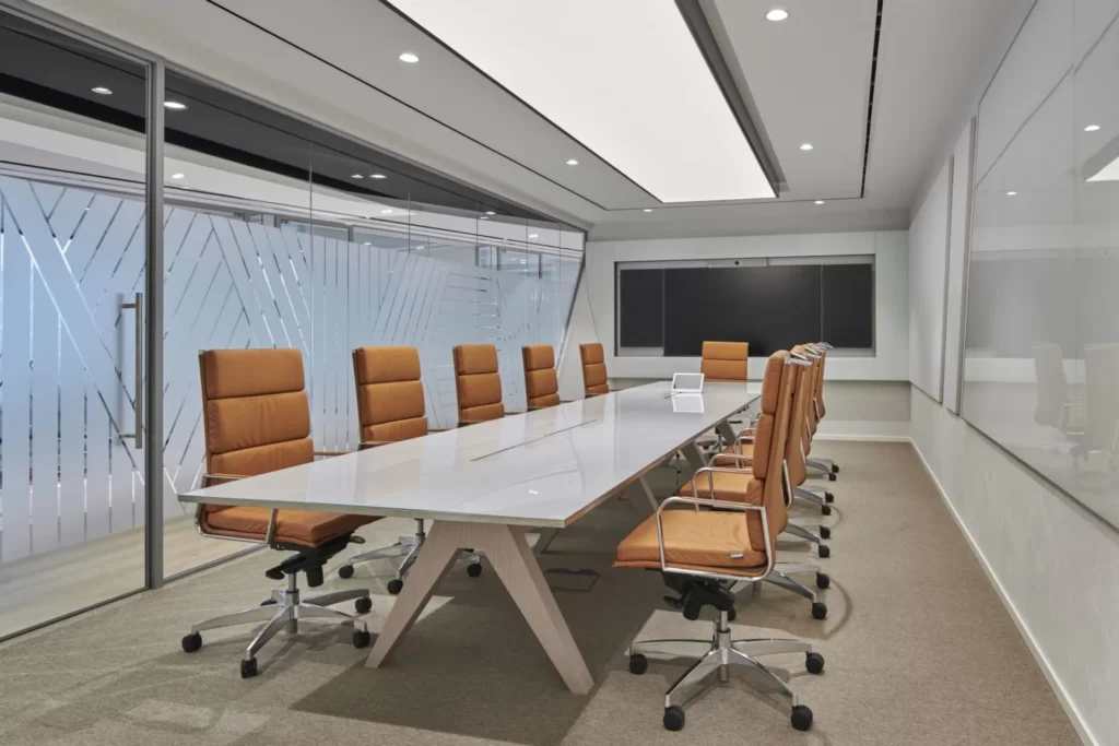
The most inspiring and challenging element of the design for Mubadala Health head office was the heart of the space “the boardroom”. The executive zone was placed all around the boardroom in the layout. It was designed to be constructed on a raised platform with a deconstructivism inspired structure, majestically towering above all other ancillary spaces, serving its purpose as the most important function in the layout. Other than the boardroom, in the “central spine” reception area: The reception desk design was something very unique created by Spacewell. Inspired by deconstructivism, holding an olive tree in its centre with a stretch ceiling above reflecting natural light streaming into the space gave it an almost zen like feel. Seating around the tree created a fluid transition from the receptions table’s main function giving the desk a multifaceted appearance and the space a true piece of art.
The project’s aesthetic concept was to reflect the futuristic persona of Mubadala Health yet keeping in mind the nature of work the client was into – which was healthcare. Healthcare is something that one would relate with trust, surety, calmness and hope. They wanted to bring these emotions in their design with the use of light, textures, materials, colours and design elements.
Natural oak veneer, polished white marble, textured concrete finish walls, pastel fabric colors, accents walls with brand colors were some of the finishes that were used. Especially the reception back wall was designed with an engraving of the Mubdala logo in concrete textured paint finish with slits of light highlighting the backwall in the most elegant and subdued fashion.
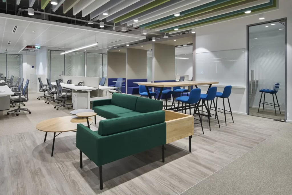
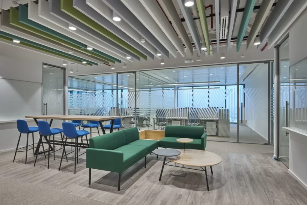
The workspace was designed with a playful collaboration area to encourage teamwork and discussions. With fabric booth seatings, acoustic fabric hanging baffles in pastel colors, brand color -blue was sprinkled around generously in the collaboration area to be a constant reminder of the company and its ethos to the employees. The health and well being of the employees was considered to be of top priority. Acoustic comfort, ergonomic furniture, focus rooms, phonebooths, team building spaces were all a part of the design we presented to the team in Mubadala Health and immediately the team understood their point of view that productivity can only increase if they give importance to employee wellness.
Flooring Supplier: Office Solutions
Click Here to Explore Office Solutions’ Full Portfolio

